Typography
About our typography
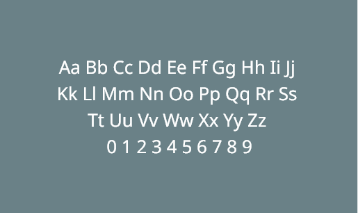
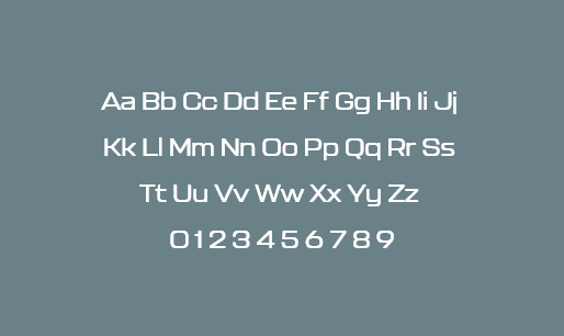
At KRONE, we use two fonts for different purposes. For continuous text and sublines, we use the linear, high-quality font “Noto Sans”. For more emotional typographic elements such as quotes or headlines, we use the font “Kallisto”.
Typo conditions
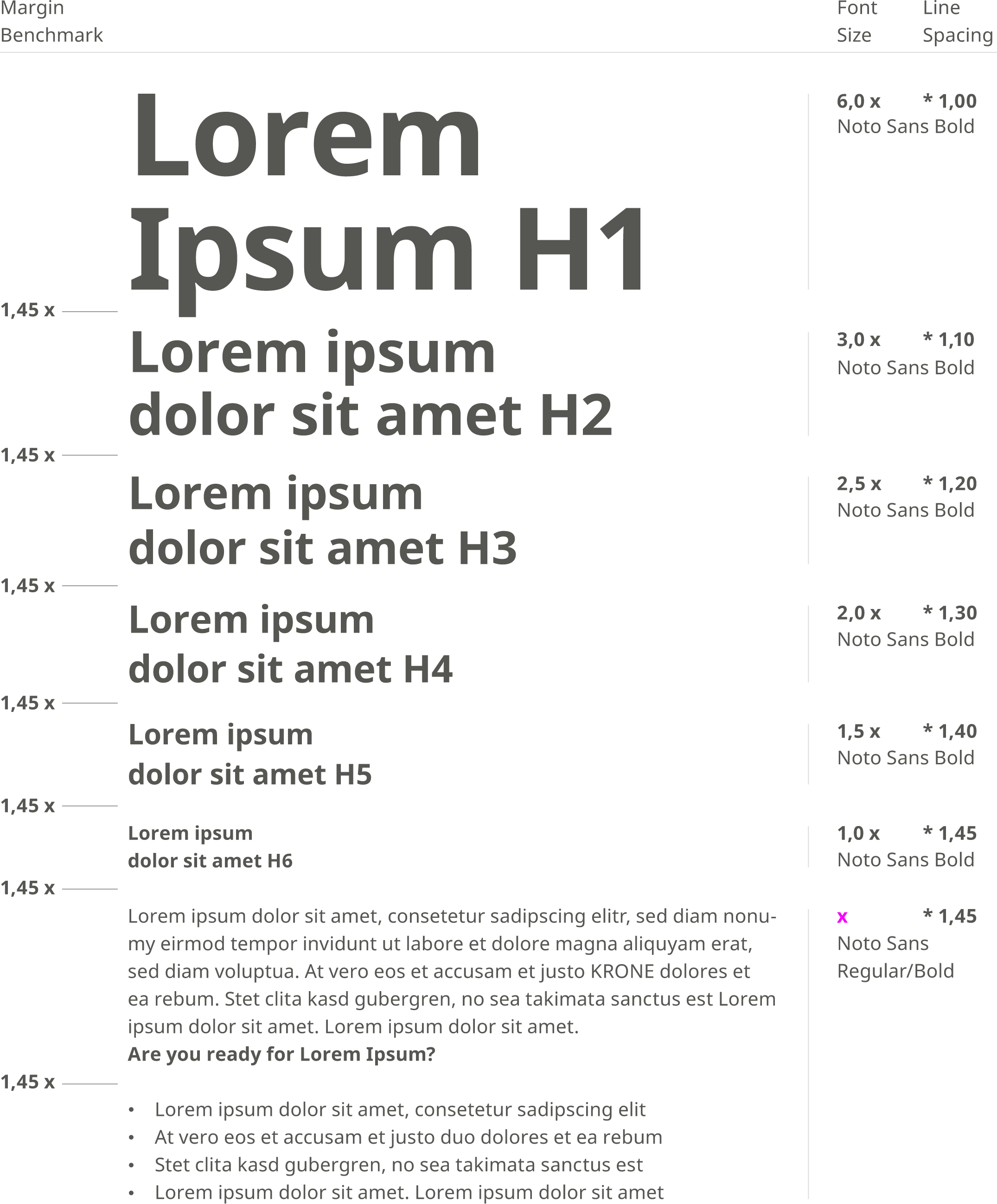
Every medium is different and has different requirements. Depending on the size, format and platform, completely different font sizes are required. For this reason, KRONE does not have absolute specifications for font sizes, but relative ratios that work across all media.
The reference size is always the font size (x) of the body text and is defined for each medium. All other formats, such as headlines, sublines, etc., are used proportionally. For example, our largest headline is six times the size of the text.
.
Kerning
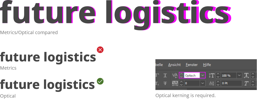
Kerning means adjusting the spacing between characters in a proportional font to achieve a visually pleasing result. By using optical kerning, we create a balanced letter spacing in texts. Especially with larger typo formats, such as headlines, you should manually adjust the kerning again.
Correct spelling of KRONE
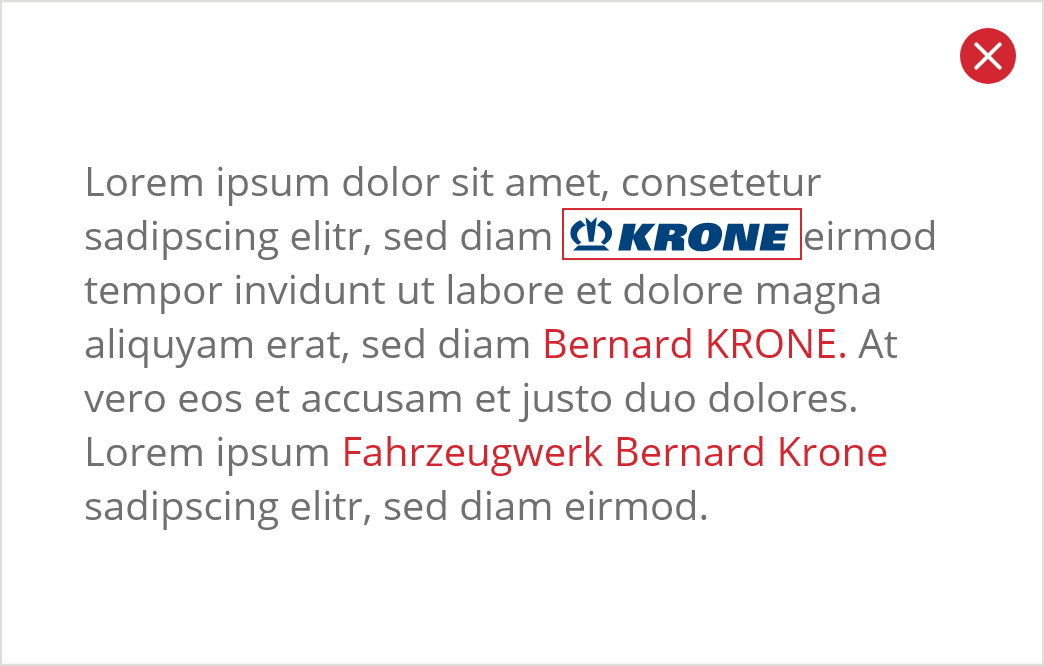
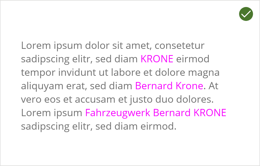
Although the brand name KRONE and the surname/family name Krone are identical, we carefully distinguish the spelling! We always write our brand name KRONE in capital letters (except in press releases), not the family name Krone.
The logo itself may not be incorporated into texts.
