
Colours
The KRONE colours
One of the key style elements for our brand are the colors. The color blue is known worldwide through our product design. In our communication, we use blue very strongly to represent our values in the best possible way.
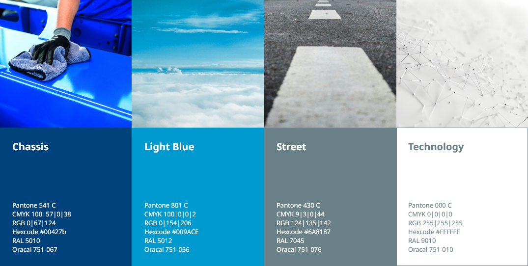
Primary colours
The colors are inspired by the use of our products on the road. The blue in particular stands for our chassis, the basis of our products. The dark shade of blue is therefore also our base color. There is also a choice of light blue, which can be used as a complementary color, but should not be the main focus. The shade of gray stands for working and driving on the road and the white for our technologies. All of these colors can be used in our communication design – the dark blue tone should be present in every medium at all times.
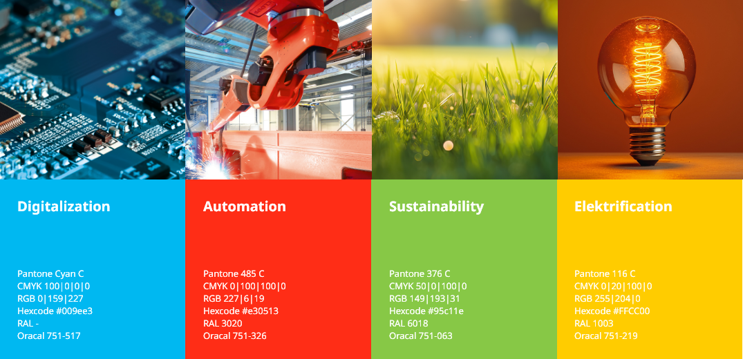
Highlight colour
In addition, we use four other colors in our appearance that stand for our four core themes (sustainability, digitalization, automation and electrification). These colors can be used in addition to our basic colors when our core themes are addressed. The colors are mainly used for campaigns and trade fair visuals.
Percentage colour distribution
Our colors are used in a specific ratio. This can vary depending on the area of application. The percentage distribution is a recommended guideline and does not have to be strictly adhered to. But always remember: blue is our main color and should be present everywhere.


Black and white as a base
In addition to the brand colours, black and white are used for certain basic elements. For example, white always serves as the basis for all media. For some elements, the exact gradation is flexible and depends on the area of application.

KRONE Colour Libraries Download
aes/zip
1 kb
KRONE Colours CMYK
aes/zip
0,5 kb
KRONE Colours RGB
aes/zip
0,5 kb
All colours are also included as hex colour codes in our Basic UI Kit. So if you want to develop a UI design, just download the Basic UI Kit.

